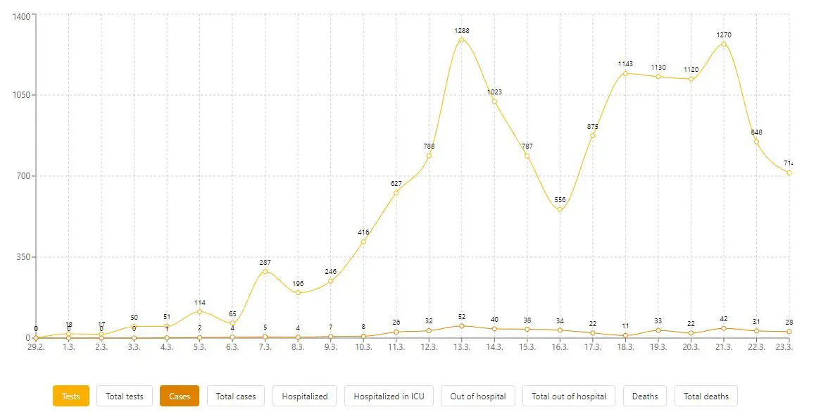
Slovenia acted relatively early in closing things down for COVID-19, and, at least compared to some other countries, people seem to be following the guidelines and behaving responsibly. But while we all know the headline figures - how many cases, how many deaths - what about some other numbers? One place to turn is this excellent website from Joh Dokler, that pulls together a lot of data and visualises it. What we put in the headline, and main image, is hospitalisations and ICU occupancy, but look at the bottom of the graph and you can see a lot more - tests, total tests, cases, total cases, and so on.
Related: How many hospital beds are there in Slovenia?
Daily tests, daily cases
It's interesting to play around with, and with luck over the next two weeks will show that the social distancing and hand washing we've been practicing have paid off, and life can return to something like normalcy, albeit with the knowledge we're all gaining about the value of small joys, the fragility of our systems, and the fact that we're in this together. So click here to explore more, and take care to be kind with the time you have left.
All our coronavirus stories can be found here


