A little while ago I wrote about a wonderful guidebook to the capital, Let’s See Ljubljana… Beyond its utility and charm, it’s a book that means a lot to me personally, because when I first arrived in Slovenia and was hit by culture shock and disorientation, after almost two decades in the 24/7/365 neon glare of Asia, it gave me a way into the quiet town of Ljubljana through reliable landmarks that had stood the test of time and would serve as anchors for my new life
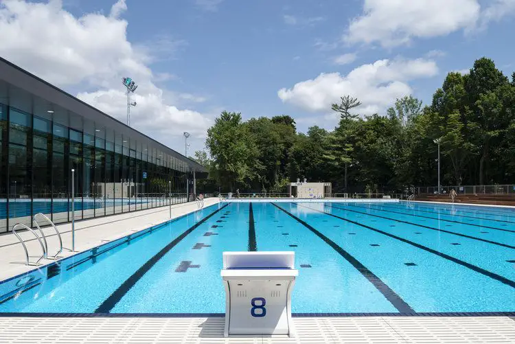
Swimming pool, Kolezija, Ljubljana. Designed by Ravnikar- Potokar. Photo: Virginia Vrecl
I adopted the pen name JL Flanner because it was slightly more subtle than LJ Flâneur, but the intent and belief remained. If I gave myself up to the city then I’d be rewarded somehow, even if just with a better sense of place and a clearer understanding of my surroundings. So when I got the chance to meet one of the authors, Robert Potokar – the other being his partner in life and work, Špela Kuhar – I jumped at it, both to express my gratitude and to see what else I could learn. It was a meeting that exceeded all expectations.
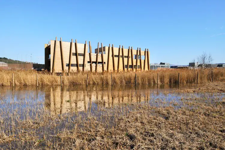
Buildings in Nature Reserve Škocjanski Zatok, Koper. Designed by Ravnikar- Potokar. Photo: Virginia Vrecl
Robert and Špela work Ravnikar - Potokar, and fans of architecture will recognise that second name, although note that this Ravnikar isn’t directly related to Edvard, the student of Plečnik who also left a considerable mark on the Slovenian capital. Edvard Ravnikar’s most visible work in Ljubljana is the complex in Republika trg, but his work there stretches out beyond this monumental landmark, and is easily spotted if you’re familiar with some of his recurring motifs, like the brickwork patterns and copper roofs. It’s in one of these other buildings, just a short walk away, that Ravnikar - Potokar has its offices, and where I met Robert to thank him for his work. We had a long, undirected conversation, without interview questions and with a walk through the neighbourhood, and what follows is some of what I learned.
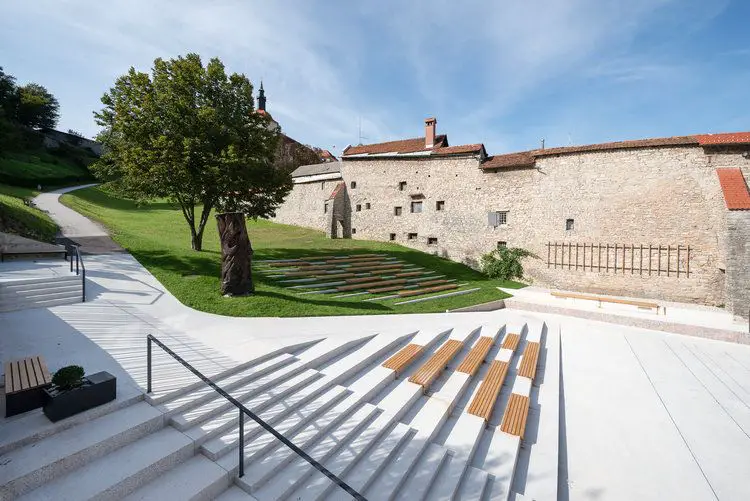
A Square and a Playground Under the Castle in Škofja Loka. Designed by Ravnikar- Potokar. Photo: Virginia Vrecl
On his books
I was born in Kranj, but I spent my childhood in Škofja Loka, which is my first love. I’ve also written a guidebook for the Gorenjska region, along with my wife, Špela Kuhar, going through all the important buildings. Traditional architecture, local architecture, churches, everything. An overview of the whole region. It was a lot of work, and people ask we if I’ll make another one, but, well, it’s a lot of work. You start a book and you think this will be a one year project. But then you go deeper, and it’s fractal, it just keeps growing, and if you don’t have a deadline it’s never-ending.
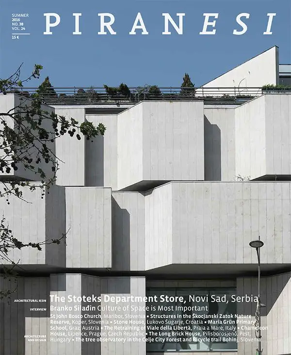
In between we succeeded in making make another guide to Ljubljana. But in general now we focus on the architectural magazine, Piranesi, and that’s OK. In our work, in architecture or life, we just make a few things, but I hope they are important.
On Ljubljana
I like Ljubljana because it’s not too big, not too small, and it’s still the capital. If you know the advertisement which was on TV for the car Clio – it’s got everything a big one has.
When it’s possible and there’s enough time I walk to work from my home in Trnovo, going different ways and seeing what’s new, or new to me. Seeing people, seeing architecture. When I take people or tourists around the city we don’t only look at buildings, but also things that are nice or not so well known, and in this way they can remember the architecture better itself, and the way the city functions as an evolving whole, with different layers of history and use still present, even today.
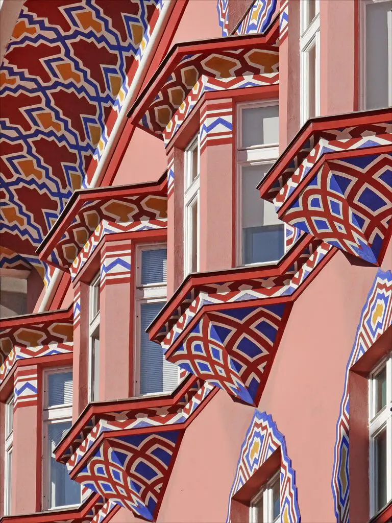
The Cooperative Business Bank Building on Miklošičeva. Flickr - Jean-Pierre Dalbéra CC-by-2.0
How things have changed
Do you know the Cooperative Business Bank Building on Miklošičeva? After the Second World War, during socialist times, people were like “come on, this is so ugly, all these decorative elements.” In the 50s, 60s, 70s, maybe even until the 90s, it was seen as nothing special. It was in bad repair and that kind of decoration was out of fashion. But after tourism developed it became one of the most notable and characteristic buildings. A building which is kept in our memory.
So it’s interesting how things change over time. When it was built it was important, and then for decades it was not, architects just didn’t like it.
It’s the same with Plečnik. It wasn’t until the big exhibition of his work, in 1986 in Paris, that he somehow came back to Ljubljana. It was a time of postmodernism, a boom in decoration, and that’s when he got rediscovered. You know, in the 60s and 70s people weren’t really taught about him at the Faculty of Architecture. I was there in the 80s, and we went to Paris to see that show and it was actually a surprise to see what he’d done.
Mali Nebotičnik
On his favourite building
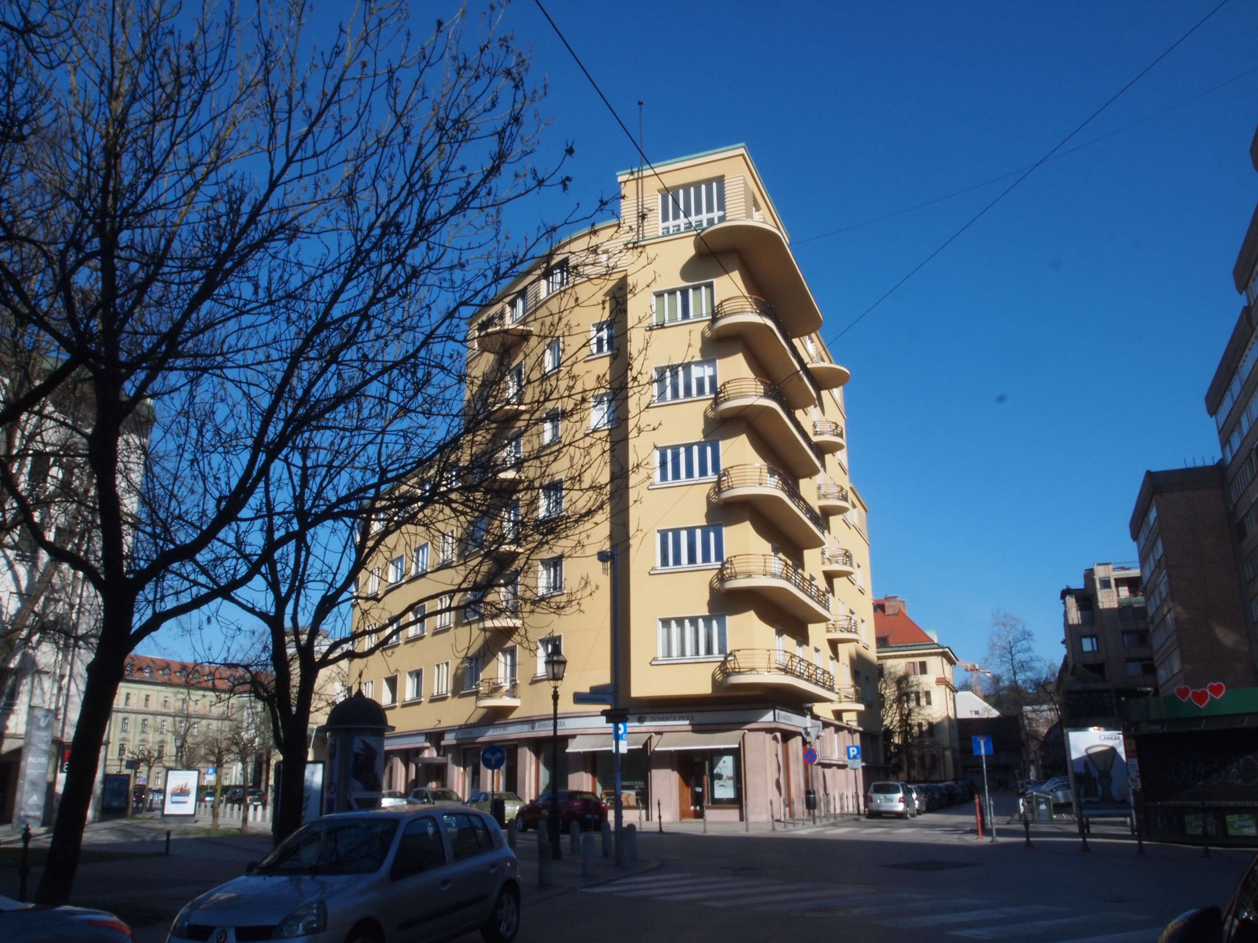
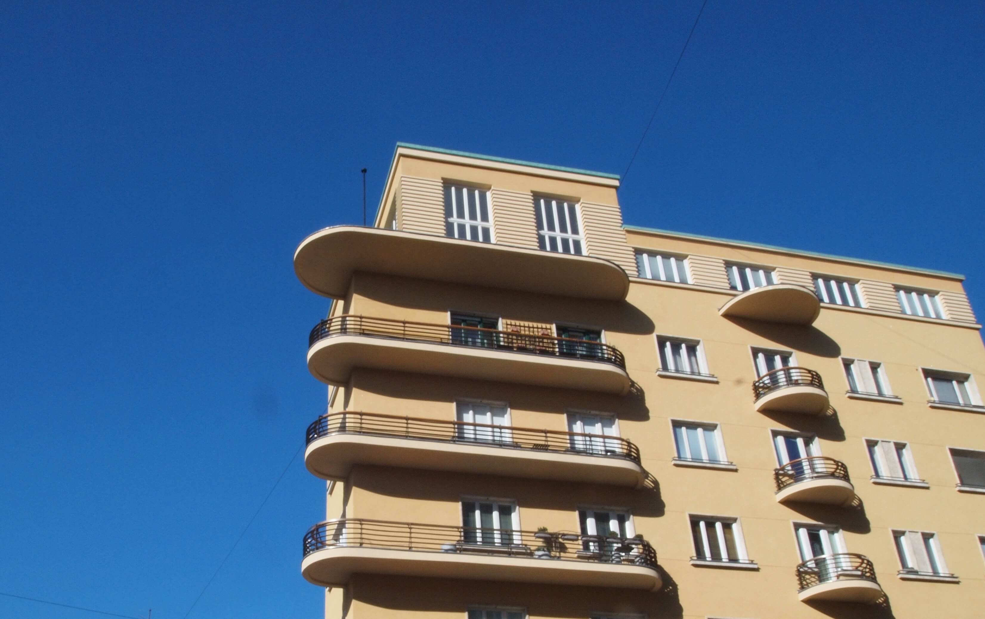
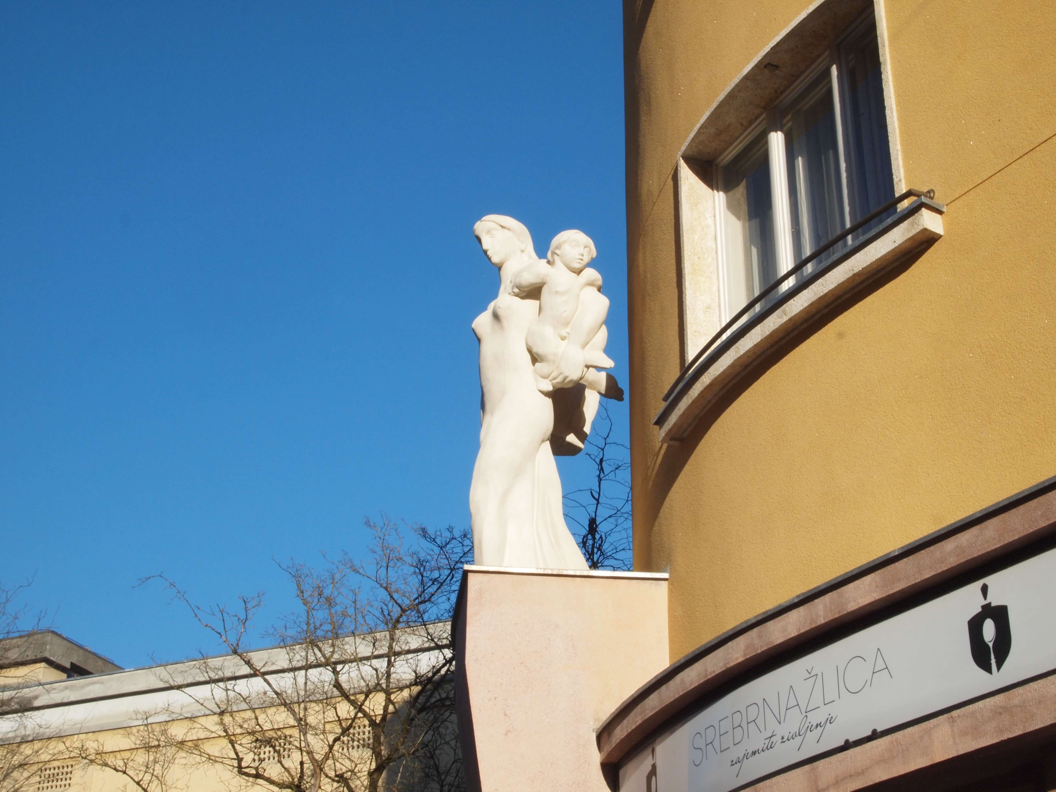
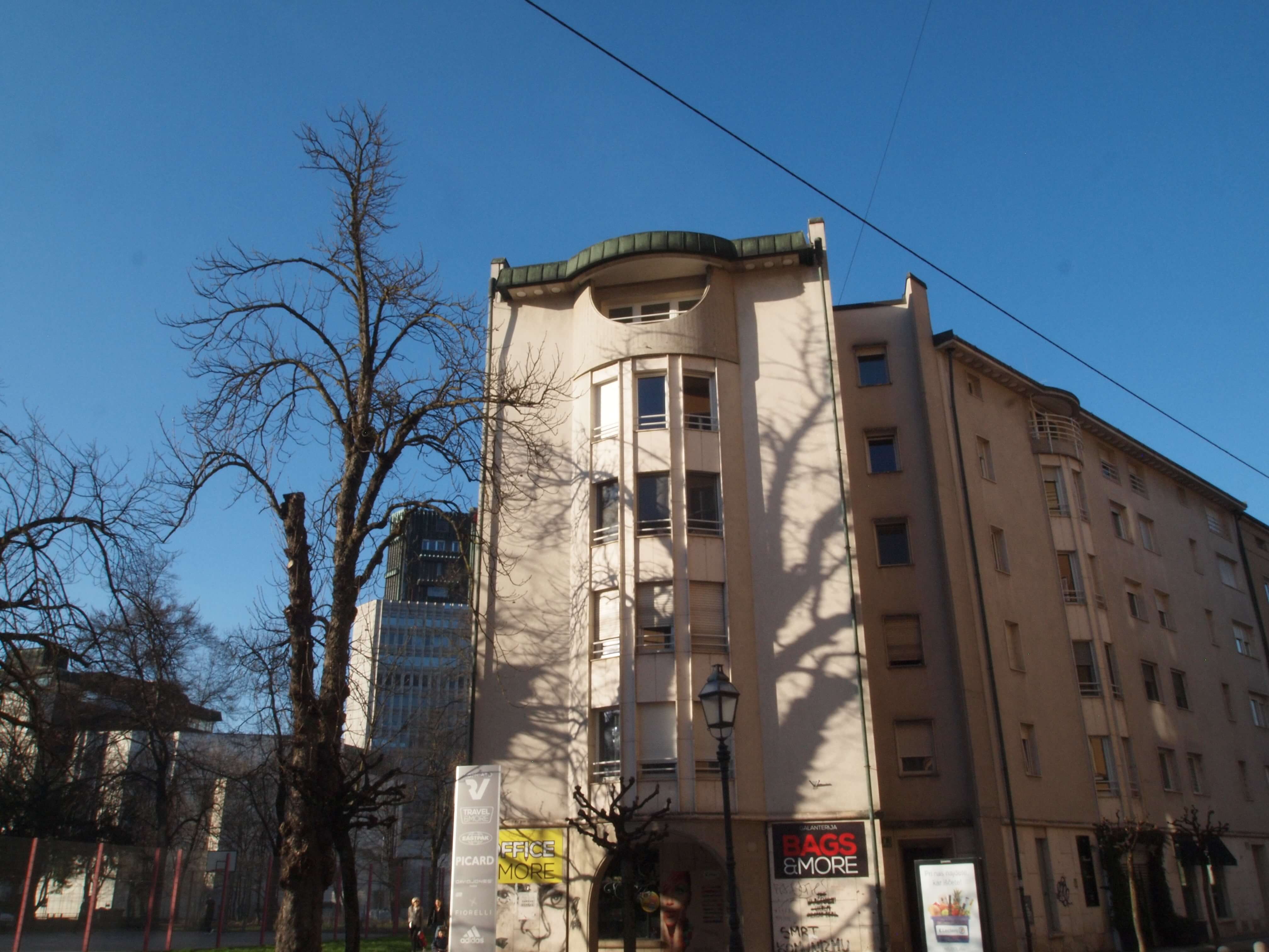
My favourite in the city of Ljubljana is one just near here, on this street, Mali Nebotičnik (“Little Skyscraper” - see map here). It’s an example of modernist architecture, and in my opinion one of the best, from the 1930s. And not just here, but really in the world. In a way it’s so simple, but it fits the location perfectly and it’s got all typical modernist elements: curved lines as well balconies, railings, details and a sculpture by sculptor Tone Kralj. Modernism was known by adding sculptures on the façades. There are some other buildings like this in Ljubljana, such as at Argentinski Park, but this is the nicest. It’s not so well known, but it’s got really a lot of remarkable features, especially how it fits into the place, although the inside isn’t so special.
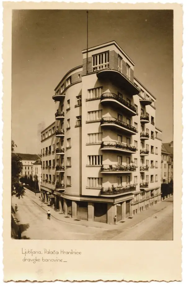
Postcard of Mali Nebotičnik (1930s? 40s?). Wikimedia, public domain
Because of its location, right in the centre, the people who bought apartments were rich, or artists. It was renovated just last year, and they did it very well, more or less the same colour as before, perhaps a little more vivid.
It wasn’t so out of fashion as Plečnik, because it isn’t so decorative, and in many ways not so different to socialist architecture, so aesthetically, ideologically, it didn’t have so many problems.
The lighting system for the store names is original, and really well done, with this style being common all over Europe in the 1930s, and even in Argentina, Buenos Aires. Curved balconies are very common, and the top floor is higher because there were studios inside.
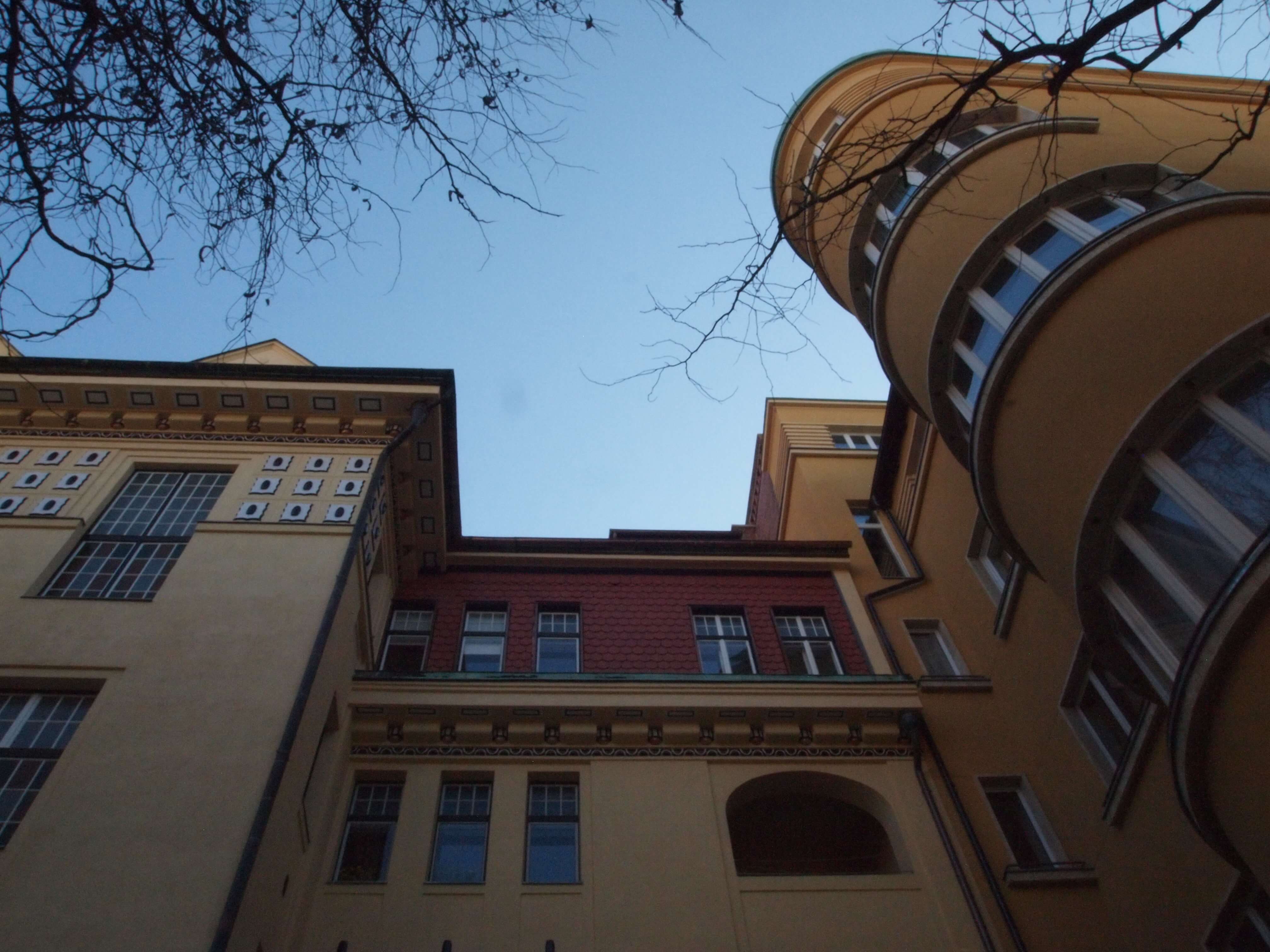
If you look at the building next door, built by a German architect, I think, in around 1910, you can see how the architect of the Little Skyscraper (Herman Hus) understood the location, in urbanistic terms, and was able to integrate his work into the space.
If you look at this building here [see below], I think it was done in the 80s, and the architect tried to use some of the same elements, but it’s not as nice (although nothing is).
On Edvard Ravnikar
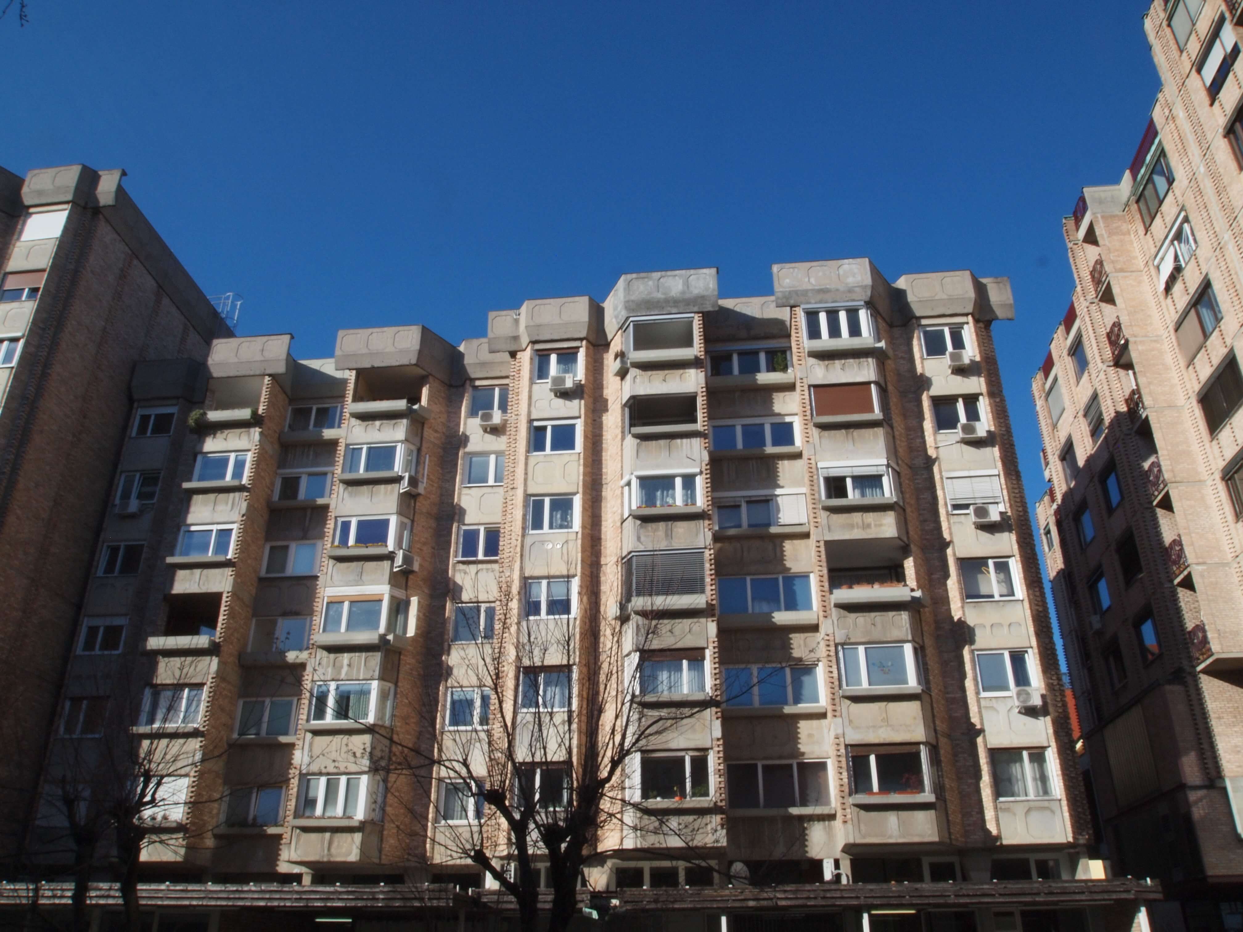
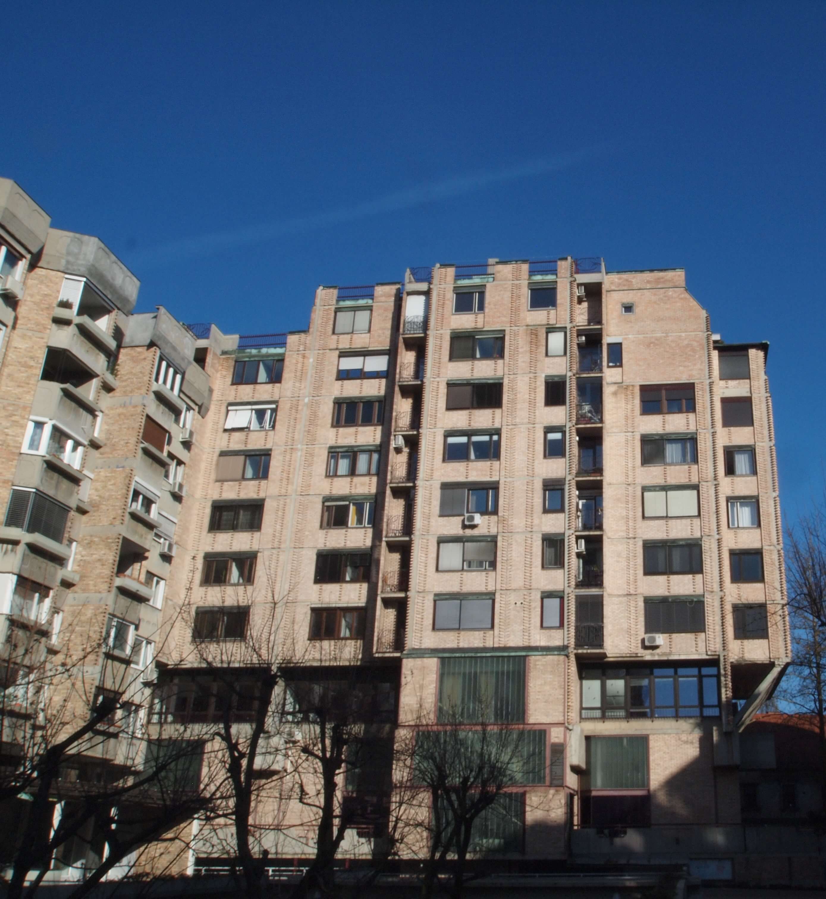
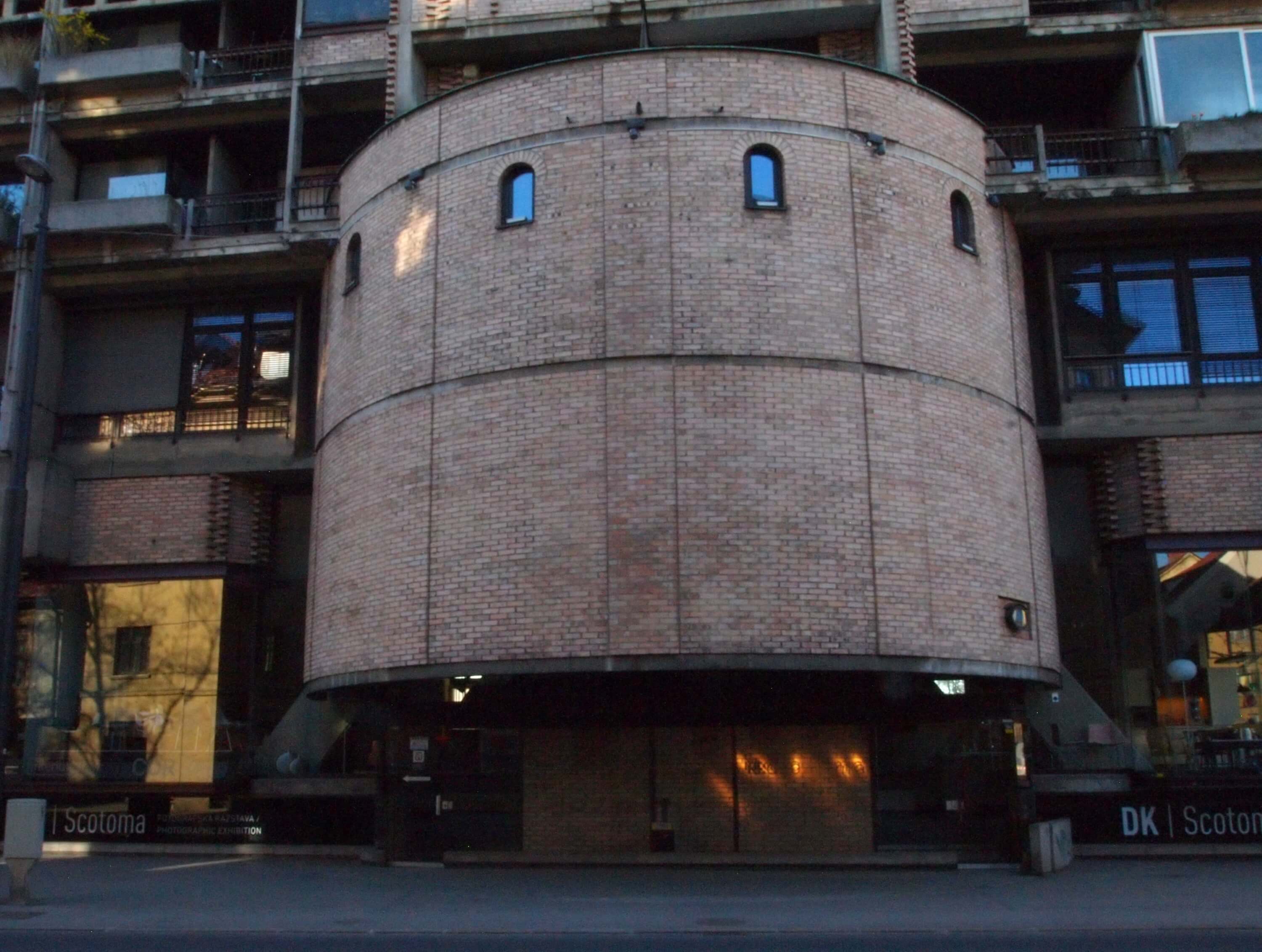
My late partner in this firm (Ravnikar – Potokar) was called Vojteh Ravnikar, but no relation to Edvard. In fact, the building we’re in now, part of the Ferantov vrt complex, is a Ravnikar, and I think it’s one of the nicest apartment buildings in Europe. Although these days it’s out of style, and people don’t really like the socialist architecture at the moment. That said, with the big MoMA exhibition of arhitecture in ex-Yugoslavia last year [Concrete Utopias], things are changing.
In some ways it’s less socialist and perhaps even “baroque”. These were quite prestigious apartments when they were built, with space for offices and stores at the bottom, a mixed use complex.
You can see how the shops come out of the floorplan, and this way gives more light to the apartments. If you look at the balconies they’re not at right angles, but diagonal, and this also gives more light and privacy. So the details are very well thought out, especially if you compare this to architecture that was done in Eastern Bloc at the same time, in the 1960s, it’s incredible, almost Scandinavian style.
Another very special thing about Ferantov vrt, which you can see from Slovenska cesta, is how Ravnikar somehow introduced the Roman form. Because here, underneath, there were the ruins of Emona – the Roman Forum. For example, there was a basilica, with an apse. So the architect decided to present this in the new structure, with this postmodern evocation of Ljubljana’s past.
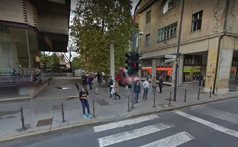
There’s another detail, this column [see below, in a bad picture from Google Maps because there's nowhere to stand]. Originally the house where Plečnik was born was standing here. Of course, it was demolished, but then Ravnikar, a student of Plečnik, decided to put up this column in its place. So this column isn’t Ravnikar’s style, but it’s Plečnik’s.
Screenshot Google Maps
You can see some more of the buildings Robert and colleague have produced at his firm’s website, and if you’d like to ask about a private “walking workshop” to take you deeper into Ljubljana’s built environment, then you can email him at This email address is being protected from spambots. You need JavaScript enabled to view it.


